This printed brochure project was designed to strengthen my understanding of print design, particularly how type size, hierarchy, and typeface choice influence readability and visual impact. I began the process by brainstorming through mind maps and sketches, then refined each layout with multiple critiques that helped me adjust type size, alignment, spacing, and margins for a more balanced and professional result.
The brochure uses Futura as the primary typeface, supported by Helvetica, both of which are excellent choices for clean, modern print design. Together, these typefaces reinforce the brochure’s professional tone and help guide the reader smoothly through the content.

Front Poster
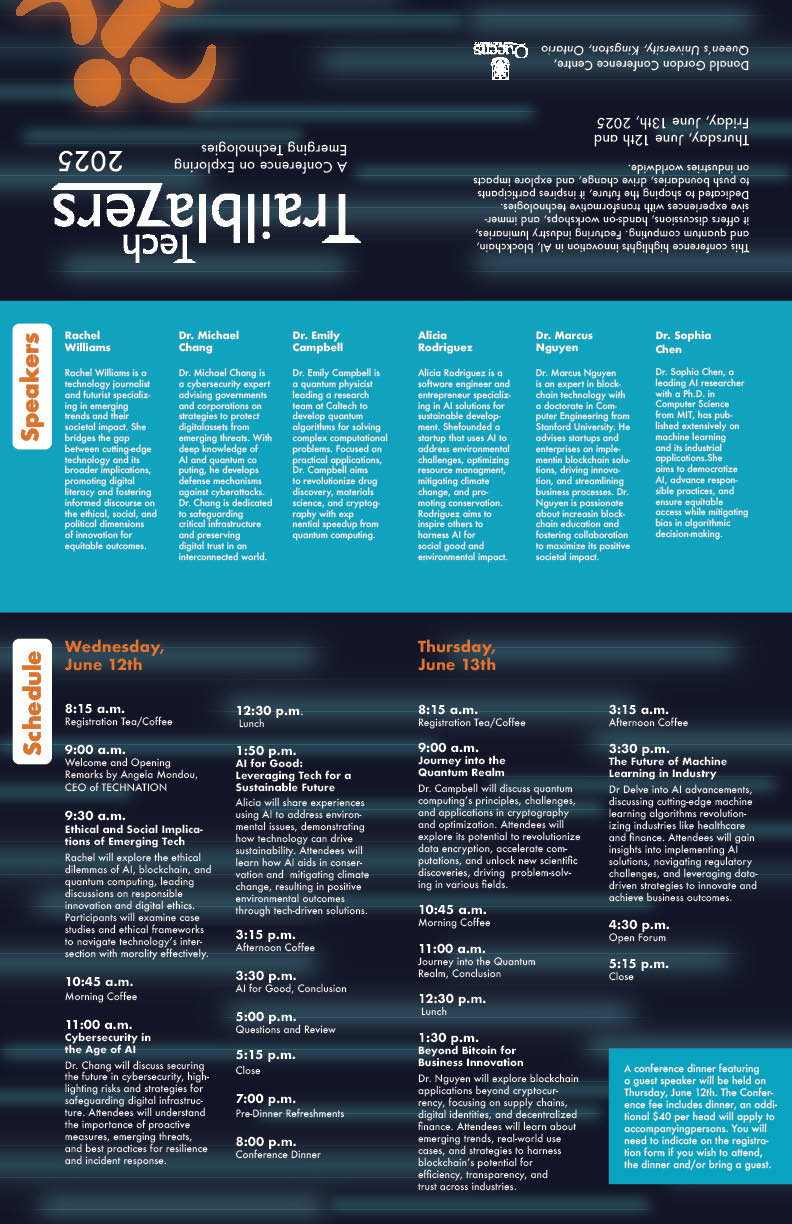
Back Brochure
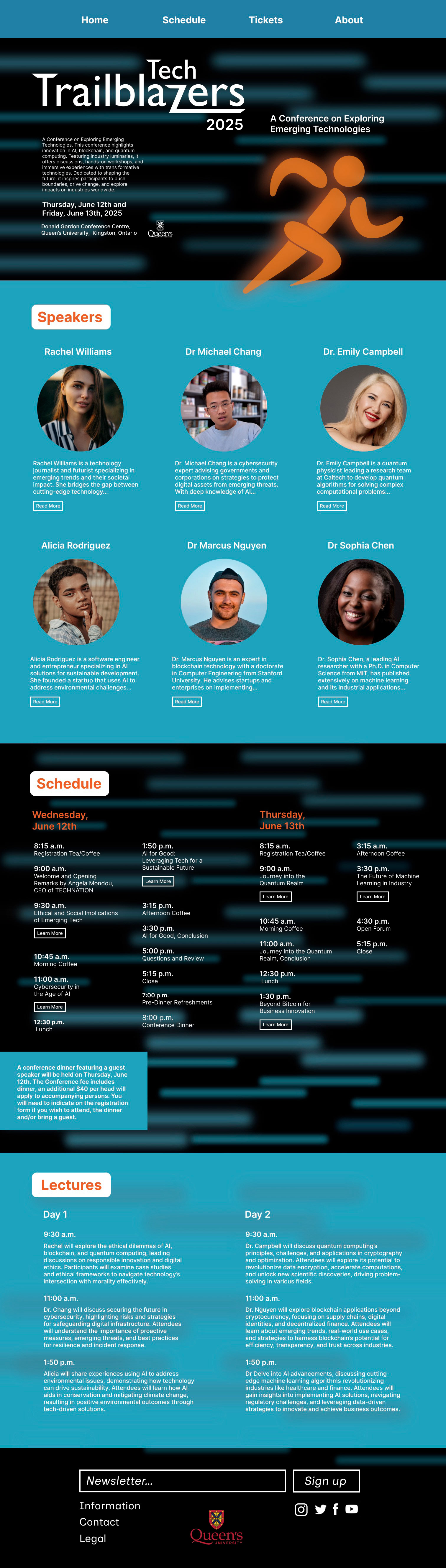
Brochure Website
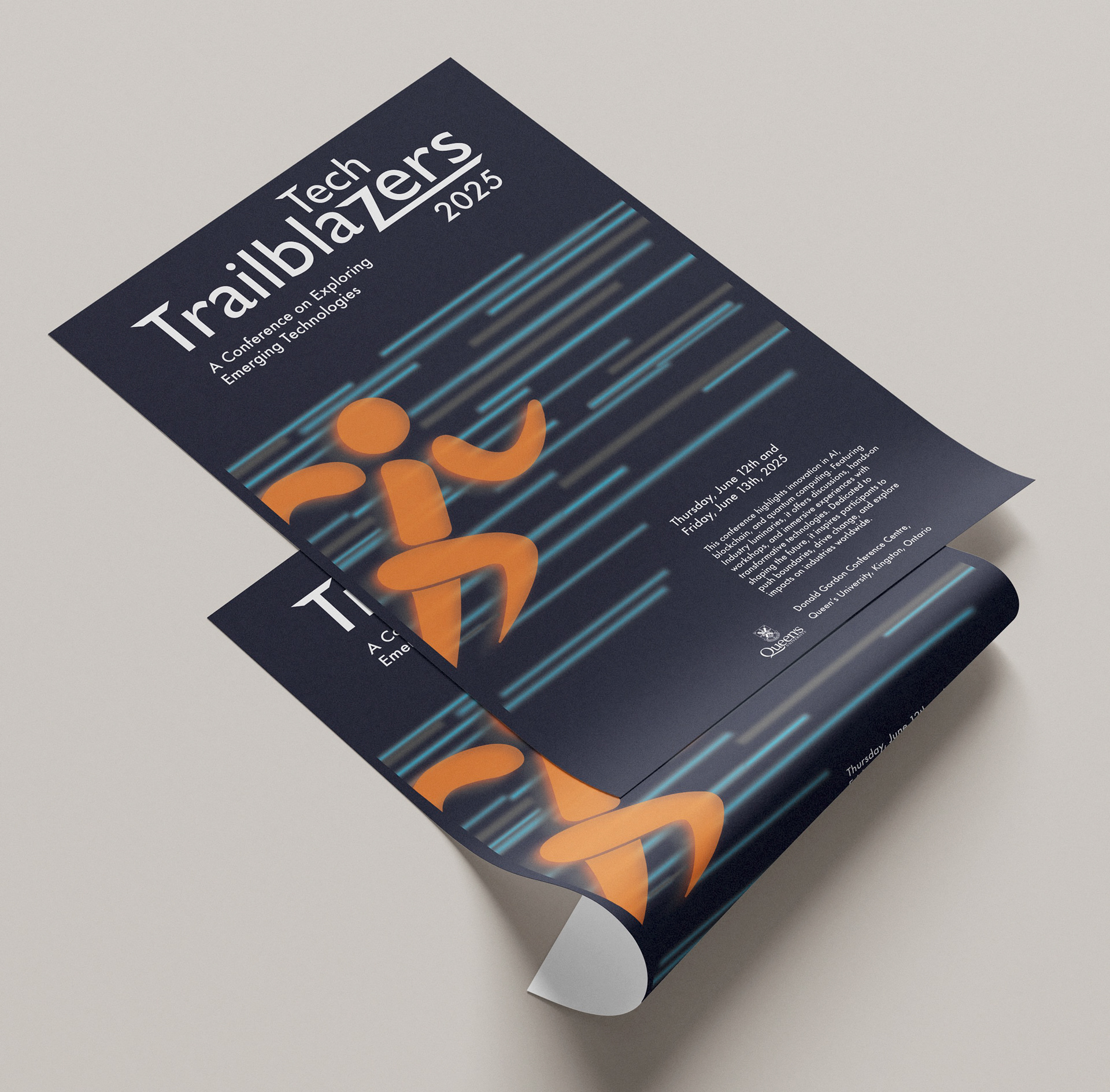
Brochure Mcokup